MABA Lab - Architecture Studio
Branding created for the Spanish architecture studio MABA Lab, developing a visual identity that reflects its contemporary approach, spatial thinking, and architectural rigor.
SOFT FRAMEWORK
The development of MABA Lab’s identity is based on the intention to visually translate the essence of the studio: a practice where architecture, interior design, and product design coexist in an organic and coherent way.
The logo synthesizes this philosophy through a soft and fluid morphology that contrasts with the precision of architectural space, creating a balance between the structural and the human. The brand is conceived as a natural extension of the studio’s spatial language: soft materials, curved geometries, and warm atmospheres are reflected in a contemporary, recognizable, and adaptable visual identity.
The result is a graphic system with its own character, capable of standing out within the architectural design landscape while maintaining a coherent presence across both physical and digital platforms.

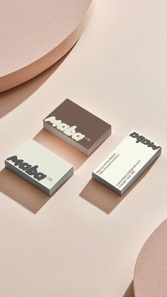
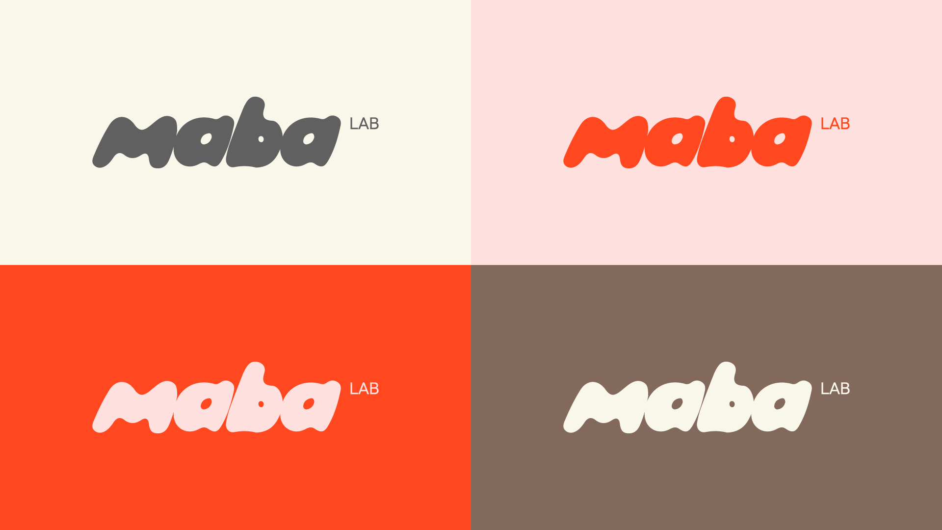
Dual Color Coded
The color palette reinforces the central duality of the project: the balanced tension between the organic and the constructed.
Neutral tones—beiges, creams, and earthy shades—evoke natural materials and the warmth of the studio’s interiors, serving as a sensory and architectural foundation.
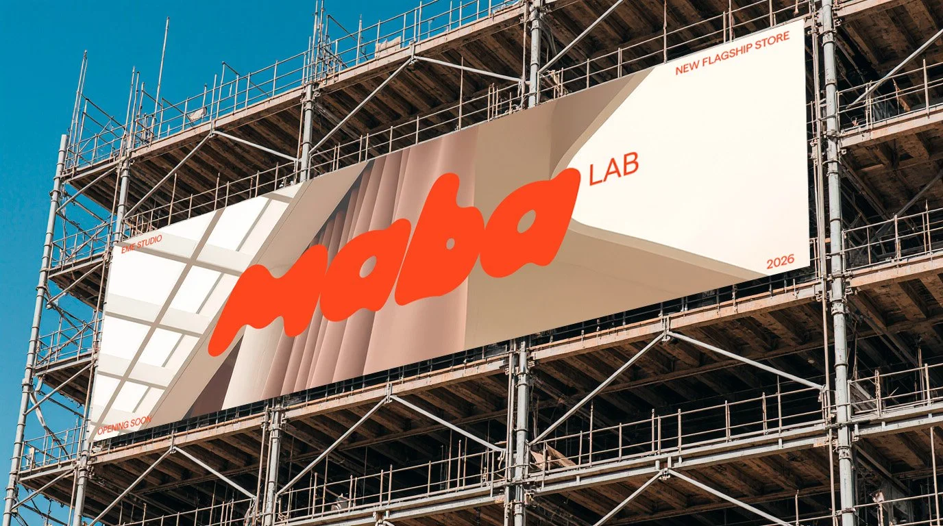
The coral accent introduces a contemporary and emotional pulse, acting as a point of energy within a controlled composition. Together, the colors not only accompany the identity but structure it: defining its human tone, its balance between rationality and fluidity, and its ability to project a recognizable presence within the field of design and architecture.
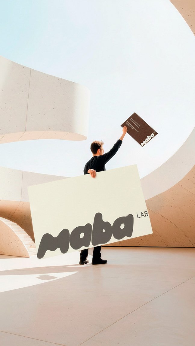
Physical & Digital Implementations